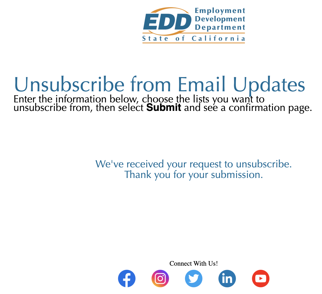
I went to unsubscribe from the State of California’s Employment Development Department’s (EDD) newsletter and I was greeted with this mess:
- The line-spacing in the top text section is way too tight
- The text section is left aligned while the rest of the content is centered
- There’s way too much space between the success message and the other section
- The CTA on the social media row is not the same font as the rest of the content.
Good news is that this is entirely fixable with a few CSS touch ups and I’ll explain how below.
Explanation my methods
For some reason, all of the content is in a table and all of the CSS is inlined exactly the same way you would create an HTML email. Perhaps the service they use for email subscription management just used an email template to create this page. I just worked within the existing framework so perhaps a certain EDD employee can copy my code. I would typically use semantic elements and only the most advanced CSS trickery to create a perfect page, but when working with other people’s code, I find it’s better to work within their framework instead of imposing my own styles and standards on someone else. Plus HTML email has limitations on what you can and can’t use so perhaps this is generated as an email elsewhere so I want to keep within the acceptable CSS and HTML properties and elements to avoid any compatibility issues.
Top text section
First let’s address the top text-section. There was 50px of left padding added to this section so I removed it and made it 5px like the rest of the section. I then added text-align: center to the section so it would align with the rest of the page.
Next, it was time to address all that crowded text. I would typically make this page title an H1 element and add a margin, but as I mentioned in the previous section, I want to keep everything kosher with the vengeful Outlook gods. I just added two br elements between the title and body text elements to create some space. I also made this heading black like the rest of the text. I highly suggest making all of your text the same color unless it’s link text. That way the links, the elements you want people to focus on and eventually click, can pop!
The reason the body text looked so crowded was because the line-height was because it was set to 115%. This caused it to look squishy and it’s a much better practice to use relative em units. Removing the style made it a bit more legible but I found a 1.5em line-height was just right.
The bold text for Submit looks differently from the rest since the font-family property was improperly implemented. You could just remove the font-family from the bold element since it’s applied to the parent span element, but, as I mentioned earlier, I want to exercise caution in messing with anything and provide my maintainer with solutions instead of new headaches.
Success Message
This element wasn’t bad it just had way to many br elements surrounding it. I just removed those extra elements and we were good to go from there. I removed the color styling here just like the heading since we really want those links to shine. The user can still see the success message just fine and they won’t think it’s a link as it’s the link color on your website. Branding guides matter!
Social Follow CTA
Just like the bold submit text, we had an improper implementation of the the font-family property. I just added the proper markup, made it bold to attract the eye, and then added a br element to create some space between the text and the social media icons.
The End Result
And there you have it. Some small tweaks and we have a perfectly functional page that’s pleasing to the eye and responsive.
Feel free to copy this code. First one is free but then you gotta pay for the next.