What is accessibility and why is it important?
Accessibility in the context of websites, refers to how easily someone with disabilities is able to read and interact with your website. There are standards known as Website Content Accessibility Guidelines (WCAG) that serve as a reference point for how to create a website that is accessible.
I believe we have a moral imperative to all do our part in creating an equitable world for all people, but there are also legal requirements under the Americans with Disabilities Act (ADA) that can leave you open to litigation if your site is not compliant. Accessibility can also impact your SEO as shown by Google’s push for accessibility. Even if you’re not motivated by a sense of justice, having an inaccessible site can seriously hurt your bottom line so let’s find some easy fixes.
Use Lighthouse to measure accessibility
Google Chrome has a great tool called Lighthouse for you to measure accessibility. Just right click anywhere on your page and select Inspect or select View > Developer > Developer Tools to open Developer Tools.
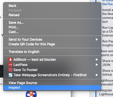
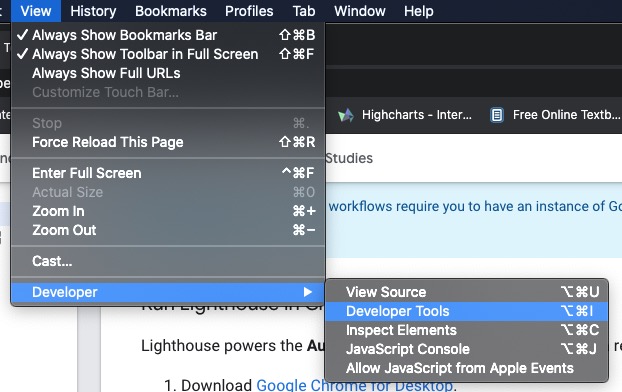
Once you have Developer Tools open, select the arrows at the end of the tab list and select Lighthouse.

Now you should have the Lighthouse dashboard open. Unselect Progressive Web App unless you have a fancy react app, select either Mobile or Desktop, and then select Generate report.
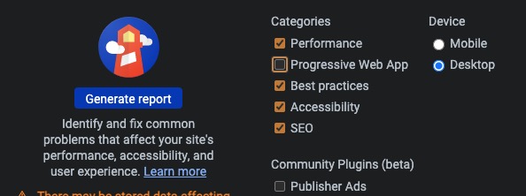
Don’t worry about choosing between Desktop or Mobile as you can generate as many reports as you desire. Just select the wee dropdown that shows the time and URL of the report.

Now you should see a report with a bunch of metrics. Select the Accessibility figure to scroll immediately to that section of the report.
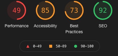
Once you’re at the Accessibility section of the report, Google will give you suggestions on what you need to fix. Just select the drop-downs for each suggestion for more details.
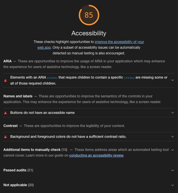
Though Google has a habit of writing suggestions fit for computer science PhDs and not the average user so I have outlined some common issues and easy fixes for you below.
Ways to Improve Accessibility
Add alt text to all images
Error: Image elements do not have [alt] attributes
For when you have images that do provide necessary context to the content on your page like the above screenshots I added in the previous views, you will need to add the alt attribute to images. The alt attribute provides a brief description of the image so that users with screen readers can hear a description of the image in conjunction with the text on the page. Don’t just say “bird” for an article on male cardinals. Say “Red male cardinal perched on a branch” so users know why you have added that image.
<img alt="Red male cardinal perched on a branch" src="male-cardinal.jpg" />
Most text editors nowadays offer the ability to add alt text via the user interface so you won’t have to hack into the mainframe to achieve this result. Also, adding alt text helps with SEO so it’s a win-win for you and your users.
Contrast foreground and background colors
Error: Background and foreground colors do not have a sufficient contrast ratio
This is a very obvious one I see all the time. Colors need to contrast for visually impaired and color blind people to properly read the text. WCAG calculates the ratio between background and foreground colors and has acceptable ratios for regular or large/bold text. Fortunately, you don’t have to calculate any of this since Google’s Developer Tools provides a solution. With Developer Tools open, select the wee arrow in a box icon at the top of the tools dashboard, then hover over the element.

Now you should see a wee report pop up:
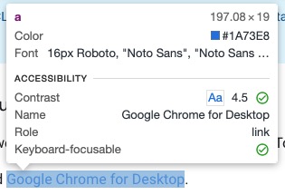
If you get green checks, you’re accessible. If not then it’s time to adjust those colors. Now I know what you’re thinking “Our brand colors are essential to our company and will cause a disturbance in the universe if we don’t adhere to the brand standards.” I’m here to say after hundreds of experiments on websites that won’t happen and I have a great tool to help you out. Use the Accessible Color Generator to get as close to your color as possible within the limits of WCAG contrast ratio standards. Make sure to use colors that are for the appropriate text size and weight to pass that accessibility audit.
Make links descriptive
Error: Links do not have descriptive text
Would you like to click here to know more or simply just know more? As you can see a descriptive link text is more eye-catching and it has the added benefit of being accessible.
Add aria-label to icon links and form inputs without labels
Error: Links do not have descriptive text
Now you might have a situation where using text is not an option like an x for a close button or a twitter icon to direct users to your twitter page. Fortunately there’s an HTML solution that you can use to solve this conundrum: aria-label.
<a href="https://twitter.com/user" aria-label="My Twitter Page">
	<i class="fab fa-twitter"></i>
</a>
In the example above I added aria-label=”My Twitter Page” to tell the screenreader that the icon symbolizes a link to my twitter page. You can add the same attribute to form inputs that don’t have labels so that the user will know which form input they are filling out:
<input type="text" name="fname" aria-label="First Name" placeholder="First Name" />
Add aria-hidden to decorative and hidden elements
Another useful HTML attribute is aria-hidden for elements that are purely decorative or hidden from view. This is useful for things like background images that are vestigial in nature or say a hidden form input that collects selected options. The general rule of thumb here is to not use it on anything that is focusable like a link or text. Here’s an example:
<img src="decorative-image.jpg" aria-hidden="true" />
In the above example, the image does not provide any necessary context to the content so aria-hidden=”true” is added so that screen readers will not read it aloud when a user is on your page.
Create a heading class to avoid sequential ordering errors
Error: Heading elements are not in a sequentially-descending order
Headings are great to use when you want some big bold text, but they need to be in sequential order for users with screen readers to effectively browse sections. For example, if you title your page with an H1 element, then the next heading element in the section needs to be an H2 or else the user will think then missed something if they skip down and it’s a H4 element. This is sort of advanced so just keep things sequential if you don’t have access to the base code. I have created a codepen to demonstrate how to achieve using non-sequential headings:
See the Pen Heading Classes by Ed Cupaioli (@ecupaio) on CodePen.
In the above example you can see that the markup for the next heading after the H1 is an H2, but I have added a class (see the CSS tab) that follows the style of the H4 element. This way we get the desired aesthetic without sacrificing the accessibility.